Designing a new analytics experience for Udacity's large scale learning programs and enterprise customers.
Team
Design Director, 1 PD, 1 PM, 2 Devs
/
Role
Sr PD (IC Lead)
/
Timeline
6 months
/
Platforms
Web
/
Audience
Enterprise Admins & Leaders (B2B), Customer Success Managers

An initiative to design new analytics dashboards for enterprise customers. This involved multiple rounds of research, design iteration, and stakeholder collaboration.
Goals:
Measure and track learning impact at scale
Provide actionable learner and program insights: progress, time spent learning, graduations, top learners, top programs, and more
Enable organizations to make data-driven talent development decisions
Guide admin users toward self-service actions based on data insights
Reduce operational costs and reliance on Udacity's Customer Success team
About Udacity: An online learning platform for organizations and individuals, specializing in tech-related subjects such as data analysis, software engineering, artificial intelligence, and web development. Udacity is part of the Accenture family of organizations focused on education and upskilling at scale.
Problem: Customer admins lacked visibility into how their learning programs were performing, making it hard to course-correct proactively or prove ROI to the stakeholders funding the program. As a result, they routed even basic performance questions and reporting requests through Customer Success, creating a support bottleneck that limited how many admins CS could meaningfully help.
How might we give admins direct, self-service access to the insights they need to steer their programs and demonstrate value, while reducing their dependency on CS in the process?
The need for productized self-service data was identified through customer requests and the significant time Customer Success spent manually building reports for customers. The project was championed by the Design Director and Product Director with a shared goal of building a best-in-class analytics suite to rival competitors.
I led an iterative research and design process to answer the questions that would shape the product:
What data matters most, and to whom? Research surfaced that admins and leaders had fundamentally different needs: admins wanted operational, actionable data to guide day-to-day program decisions, while leaders wanted roll-up, summary-level views to assess overall program health against organizational goals. This distinction directly shaped how we segmented concepts and dashboards by audience rather than by data type.
What does "success" actually look like for a learning program? No single metric could answer that. Completion rates, engagement, time-to-competency, and other data points each told a partial story — and in isolation, could even be misleading. I worked to identify which metrics needed to be paired or sequenced to tell a credible success narrative (e.g., high completion paired with low engagement signals a different story than high completion paired with high engagement), and used that framework to inform dashboard structure, not just content.
What data should prompt action, and how do we surface it? Beyond reporting on what happened, admins needed help recognizing when something needed attention. This shaped an early product principle: dashboards shouldn't just display metrics, they should help highlight anomalies or thresholds and nudge admins toward the appropriate next step — turning passive reporting into active guidance.
What depth, control, and flexibility do users actually expect? I stress-tested an 11-section proposal through two rounds of prototype testing. The content largely resonated, but testing exposed a bigger gap: static views weren't enough. Admins needed to segment and filter data to answer their own follow-up questions, interact with visualizations to explore trends on their own terms, draw their own conclusions, and create custom reports to truly make this a self-service product.
Did users actually understand what they were looking at? Testing surfaced a quieter but equally important gap: even when the right data was on screen, admins didn't always trust or understand it. Ambiguous labels, internal jargon, and unclear metric definitions meant some admins hesitated to act on what they saw or misread it entirely. Getting terminology and labeling right became its own design workstream, not an afterthought: every metric needed a plain-language label and definition an admin could interpret without a CS translator.
What could we actually build first? Testing clarified which data was most critical to lead with and how to phase the rest. I narrowed the 11 proposed sections into a 2-phase, 4-dashboard MVP plan, balancing that research signal against technical reality: what data was already available via the API, what would require new API development, and overall engineering capacity.
Alongside the dashboard designs, I partnered with the Design System lead to define new data visualization components needed to support the hub.
Phase 1
Overview: Dashboard focused on the most important metrics to help admins quickly understand needed actions and program health/status.
Learners: Learner-centric dashboard including engagement, progress, status, and leaderboards.
Phase 2
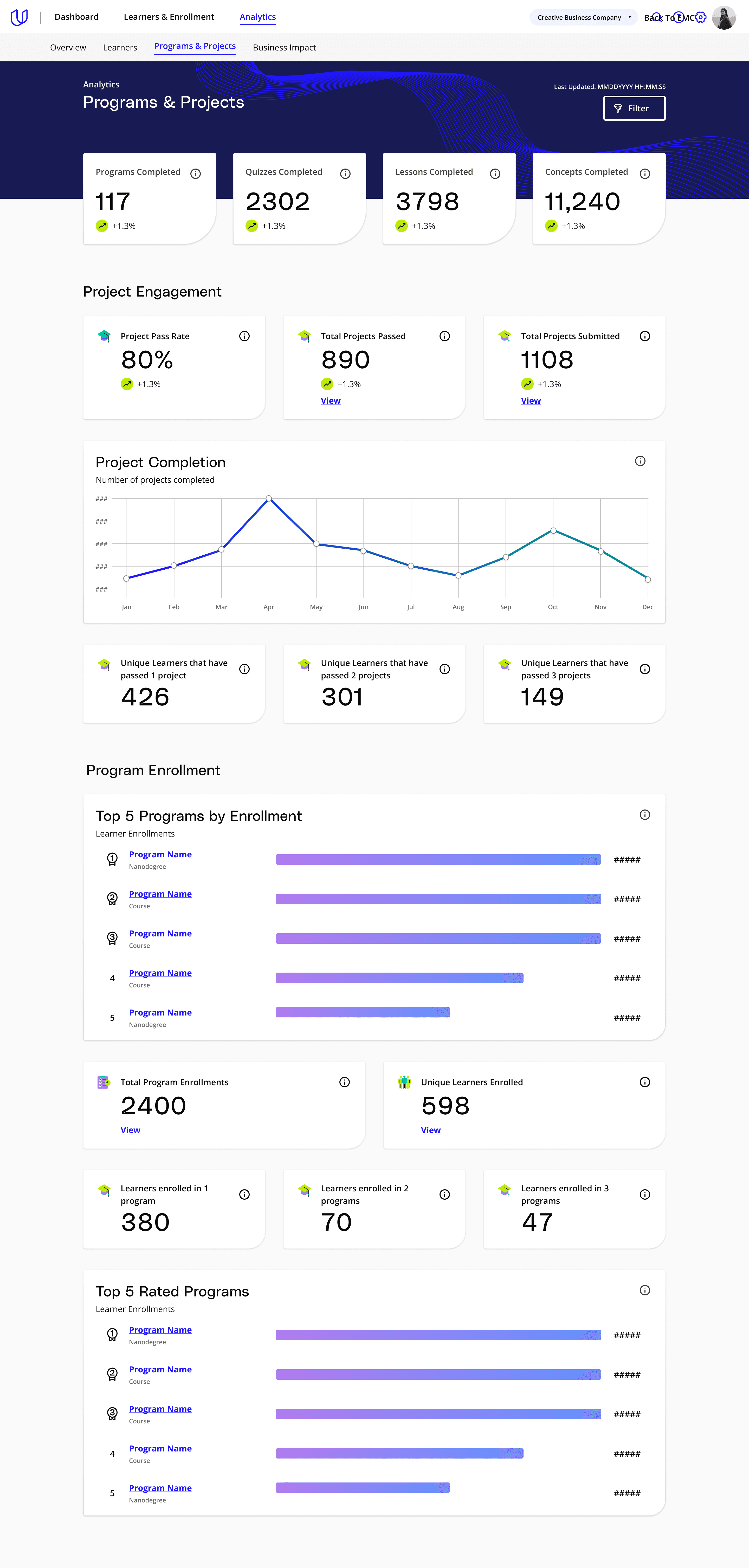
Programs & Projects: Content-centric view focused on engagement with programs and atoms of content (projects, quizzes) to understand the breadth of topics and skills learners are attaining.
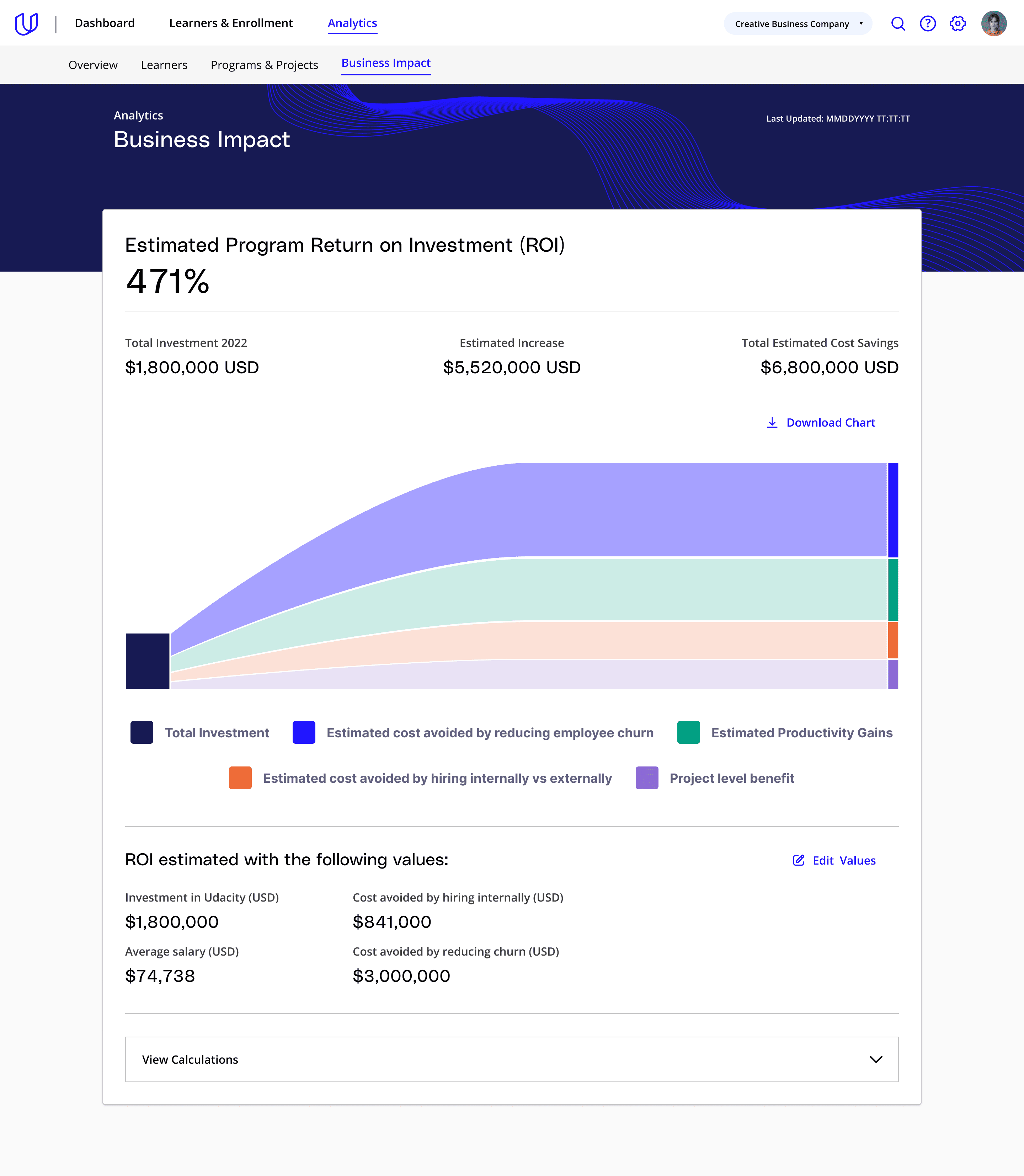
Business Impact Visualization & Calculator: Dashboard providing default estimates of value gained from implementing a learning program, plus a calculator for company-specific estimates when defaults are in question; intended to build trust and enable value conversations with decision-makers.
I delivered final Phase 1 designs and drove the beta rollout to enterprise customers, alongside Phase 2 designs for the remaining dashboards.
Phase 1 released wide 3 months after the beta release.

Overview and Learners dashboards shipped in beta to roughly 50 enterprise customers. Feedback was directionally positive: customers found real value in self-serve visibility, but also signaled that Phase 1 scope wasn't enough; most wanted more pages and specific data cuts added.
Phase 1 was released to all enterprise customers after 3 months in beta.
Customer Success requested that the Business Impact Calculator be put on hold for external release; it was later repurposed as an internal CS tool instead. Following changes in product and design leadership sponsorship, the remaining Phase 2 roadmap was not built out despite having communicated the phased plan to customers as an active roadmap.
This project was a deep education in the craft of data products: how to organize dense information into a clear hierarchy, when a visualization clarifies versus adds noise, and how much complexity lives in making an interactive dashboard feel simple at the surface. Segmenting Overview from Learners, for instance, was as much about deciding what not to show each audience as it was about what to include.
Beyond craft, this project taught me how much delivery depends on durable organizational sponsorship, not just user validation. The beta proved the concept — customers wanted more, not less — but momentum was carried by two senior champions rather than a broader, embedded commitment. When both left around the same time, the roadmap lost its push despite positive signal from the customers and internal teams.
If I were running this again, I'd push earlier for sponsorship distributed across more stakeholders and levels, not just concentrated at the Director tier, and be more conservative about external roadmap commitments before that broader alignment was locked in. Communicating a multi-phase plan to customers before sponsorship was secured beyond a couple of individuals put us in a position we couldn't fully deliver on.